Transcriptional response of PMA-differentiated U-937 cells to LPS
Transcriptional response of PMA-differentiated U-937 cells to LPS
Reanalysis of the RNAseq data (SRP152824) released by Odqvist et
al. (2019)
Reanalysis of the RNAseq data (SRP152824) released by Odqvist et al. (2019)
Sébastien Wieckowski
Sébastien Wieckowski
1 Introduction
The goal of this analysis is to identify differentially expressed genes (DEGs) in untreated vs. LPS-treated (6 h) U-937 cells using the public RNA-Seq dataset released by Odqvist et al. together with the article “Genetic variations in A20 DUB domain provide a genetic link to citrullination and neutrophil extracellular traps in systemic lupus erythematosus” (2019), under the SRA accession number SRP152824. Briefly, U-937 were differentiated into macrophage-like cells with 10 ng/mL PMA for 48 h, washed with PBS and cultured overnight in fresh medium before stimulation with 10 ng/mL LPS or vehicle for 6 hours.
This case study explores the Fc\(\gamma\) receptor (Fc\(\gamma\)R) profile of U-937 monocytic cells. We aim to identify the key Fc\(\gamma\)Rs expressed in these cells, both under basal conditions, i.e., after differentiation induced by PMA, and subsequent stimulation with LPS. Our primary concern is how these Fc\(\gamma\)Rs might influence the functions measured in some bioassay for example. While antibodies exist for CD16, CD16B, CD32, and CD64, defining the complete Fc\(\gamma\)R repertoire (particularly the FCGR2A/FCGRIIB ratio) remains a challenge. Additionally, the potential influence of other co-stimulatory and inhibitory molecules, which might be overlooked initially, is also of interest. Understanding the Fc\(\gamma\)R profile will guide the development of more comprehensive antibody panels for a deeper characterization of U-937 cells using flow cytometry. This analysis will encompass both PMA-differentiated and PMA-differentiated/LPS-stimulated cells. Ultimately, this case study aims to establish a foundation for designing future RNA-Seq experiments. By focusing on PMA-differentiated U-937 cells stimulated with LPS, the RNA-Seq data will be directly relevant to the experimental conditions employed in bioassays using these cells. It also acknowledges limitations in current analysis and proposes future RNA-Seq experiments for a more comprehensive understanding.
1.1 R packages
A variety of R packages was used for this analysis. All graphics and data wrangling were handled using the tidyverse suite of packages. All packages used are available from the Comprehensive R Archive Network (CRAN), Bioconductor.org, or Github.
# install.packages(c("tidyverse", "matrixStats", "cowplot", "ggrepel", "gt", "gplots"))
library(tidyverse)       # accessing R packages for data science
library(matrixStats)     # statistics on rows or columns of a data matrix
library(cowplot)         # combination of multiple plots in one figure
library(ggrepel)         # providing geoms for ggplot2 to repel overlapping text labels
library(gt)              # displaying tables from tabular data in publication quality
library(gplots)          # heatmap.2 function is a primary tool for making heatmaps
library(RColorBrewer)    # manage colors with R, offering several color palettes,
library(DT)              # R interface to the JavaScript library DataTables.
library(plotly)          # interactive plot
library(heatmaply)       # interactive heatmap
# the following packages have been installed using BiocManager
# if (!require("BiocManager", quietly = TRUE))
#     install.packages("BiocManager")
# BiocManager::install(c("edgeR", "limma", "rhdf5", "GSEABase", "Biobase", "GSVA", "gprofiler2", "clusterProfiler", "msigdbr", "enrichplot"))
library(edgeR)           # DGEList objects normalization methods
library(limma)           # differential gene expression using linear modeling
library(rhdf5)           # accessing the ARCHS4 data
library(GSEABase)        # functions and methods for Gene Set Enrichment Analysis
library(Biobase)         # base functions for bioconductor
library(GSVA)            # estimating variation of gene set enrichment across samples
library(gprofiler2)      # accessing the GO enrichment results using g:Profier resources
library(clusterProfiler) # suite of tools for functional enrichment analysis
library(msigdbr)         # accessing to msigdb collections directly within R
library(enrichplot)      # preparing the standard GSEA enrichment plots
2 Data Acquisition
2.1 Source of the RNA-Seq data
While the sratoolkit allows downloading raw data and
converting SRA files to FASTQ format (e.g.,
fastq-dump SRR5429562 --split-files &), issues can
sometimes arise with paired-end data generated from this method.
Therefore, an alternative approach is to download the single-end reads
directly from the ENA FTP server. This can be achieved using commands
like
wget ftp://ftp.sra.ebi.ac.uk/vol1/fastq/SRR542/004/SRR5429564/SRR5429564_1.fastq.gz.
Even though the downloaded files are compressed with gzip, consider
storing them on an external hard drive for efficient storage and
retrieval. To automate downloading individual FASTQ files into dedicated
directories, you can use a command like
wget -P ./SRRxxxxxx --quiet within a parent directory. This
will download each file to a folder named after its SRA accession number
(SRRxxxxxx) and suppress any download logs.
For this study luckiky we have access to the data via the All RNA-seq and CHIP-Seq Sample and Signature Search ARCHS4 so that we can restrict the analysis to the samples of interest, i.e. control cells stimulated of not with LPS.
2.2 Alternative data preparation
If not readily accessible in ARCHS4, the procedure may involve multiple steps prior to the analysis:
- Base calling with BCL to FASTQ file converter bcl2fastq2 (Illumina)
- FASTQ files quality check with FastQC (Andrews 2010, “FastQC: a quality control tool for high throughput sequence data.”)
- RNASeq paired-end reads mapping onto the human genome (build hg38) with read aligner STAR, e.g., using default mapping parameters (Dobin 2013, “STAR: ultrafast universal RNA-seq aligner.” Bioinformatics 29)
- Aligned reads QC with MultiQC (Ewels 2016, “MultiQC: Summarize analysis results for multiple tools and samples in a single report.” Bioinformatics 32)
- Numbers of mapped reads for all RefSeq and/or Ensembl transcript variants of a gene were combined into a single value, i.e., transcript count, assuming reverse stranded library by featureCounts (Liao 2014, “featureCounts: an efficient general-purpose program for assigning sequence reads to genomic features.” Bioinformatics 30) and normalization as TPM (transcripts per million).
2.3 Selection of the samples
The samples to be analyzed have been selected from GEO as follow:
2.4 Study design
The study design was modified to clarify the sample identifiers,
i.e., WT_Unsort_LPS_09 was relabeled to LPS_4
and WT_Unsort_01 to CTR_4. The tretment group
encoding is ctr for untreated/control cells, and
lps for LPS-stimulated cells.
2.5 Loading of the ARCHS4 database
We can access data either through the ARCHS4 website or using the rhdf5 package. The ARCHS4 database in HDF5 file contains RNAseq data already aligned using Kallisto. Note that this file for human gene expression takes about ~17GB of space on the hard-drive. More information at Massive mining of publicly available RNA-seq data from human and mouse. Nature Communications, April, 2018.
# the expression file should have been downloaded locally from https://maayanlab.cloud/archs4/download.html
archs4_human <- "human_matrix_v11.h5"

# use the h5 list (h5ls) function from the rhdf5 package to look at the contents of the database
#h5ls(archs4_human)
#441356 x 35238 human samples vs genes

all_samples_human <- h5read(archs4_human, name="meta/samples/geo_accession")

# query ARCHS4 database
samples_locations <- which(all_samples_human %in% samples_archs4)
genes <- h5read(archs4_human, "meta/genes/genes") # extract gene symbols from the metadata; "meta/genes/genes" in most recent versions
expression <- h5read(
    archs4_human,
    "data/expression", # extract expression data
    index = list(samples_locations, 1:length(genes))
)
colnames(expression) <- genes
rownames(expression) <- samples

# it looks like the format of the new matrix version has been pivoted
expression <- t(expression)
It is also possible to extract sample metadata directly from ARCHS4 to create a study design (not evaluated).
# extract the sample source
sample_source_name_ch1 <- h5read(archs4_human, "meta/samples/source_name_ch1")
# extract sample title
sample_title <- h5read(archs4_human, name = "meta/samples/title")
# extract sample characteristics
sample_characteristics <- h5read(archs4_human, name = "meta/samples/characteristics_ch1")

# we put all of this together in a study design file
studyDesign_2 <- tibble(
    sample_title = sample_title[samples_locations],
    sample_source = sample_source_name_ch1[samples_locations],
    sample_characteristics = sample_characteristics[samples_locations]
)

# based on what we extracted from ARCHS4 above, we can customize and clean-up further the study design file
studyDesign_2 <- tibble(
    sample_title = sample_title[samples_locations],
    treatment = c("lps", "lps", "lps", "lps", "ctr", "ctr", "ctr", "ctr")
)

# and capture experimental variables as factors from this study design
treatment_2 <- factor(studyDesign_2$treatment)
sample_name_2 <- studyDesign_2$sample_title
3 Data Preprocessing
The sequencing depth for the extracted samples is as follows:
##    LPS_1    LPS_2    LPS_3    LPS_4    CTR_1    CTR_2    CTR_3
## 22353512 18531783 16770369 17259959 16285988  8835079  9051944
##    CTR_4
## 14695838
3.1 Data wrangling
To prepare the downloaded data for analysis, we’ll need to perform
some additional steps. First, we’ll create a DGEList object in R, which
is a data structure commonly used for storing RNA-seq counts. Then,
we’ll utilize the cpm function from the EdgeR package to
calculate counts per million (CPM) for each gene. CPM is a normalized
expression measure that allows for easier comparison across samples.
data_dgelist <- DGEList(expression)
# DEGList objects are a good R data file to consider saving to a working directory
data_cpm <- cpm(data_dgelist)  # use the 'cpm' function from EdgeR to get counts per million
Now the column sums of the cpm data are: 10^{6}, 10^{6}, 10^{6}, 10^{6}, 10^{6}, 10^{6}, 10^{6}, 10^{6}.
3.2 Log transformation
To further prepare the data for analysis with tidyverse tools, we will perform two additional steps:
- Log2 transformation: this transformation helps to normalize the data and make the distribution of expression values more symmetrical. This is particularly important for RNA-seq data where expression levels can vary greatly across genes.
- Coercing the data matrix to a dataframe: this converts the data from
a matrix format (commonly used for storing counts) into a dataframe
format. Dataframes are more versatile and easier to work with within the
tidyverse ecosystem, allowing for efficient manipulation and
visualization using tools like
dplyrandggplot2.
log2_cpm <- cpm(data_dgelist, log=TRUE)
log2_cpm_df <- as_tibble(log2_cpm, rownames = "gene") # transformation into a dataframe
colnames(log2_cpm_df) <- c("gene", samples)
# use the tidy package to 'pivot' your dataframe (from wide to long)
log2_cpm_df_pivot <- pivot_longer(
    log2_cpm_df, # dataframe to be pivoted
    cols = 2:9,                 # column names to be stored as a SINGLE variable
    names_to = "samples",       # name of that new variable (column)
    values_to = "expression"    # name of new variable (column) storing all the values (cpm)
)
We can have a look at a sample of the resulting dataframe:
We create now the first figure panel to be plotted using ggplot2 and consisting of unfiltered and non-normalized data, log2-transformed.
p1 <- ggplot(log2_cpm_df_pivot) +
aes(x = samples, y = expression, fill = samples) +
geom_violin(trim = FALSE, show.legend = FALSE) +
stat_summary(
    fun = "median", geom = "point",
    shape = 95, size = 10, color = "black",
    show.legend = FALSE) +
labs(
    y = "log2 expression", x = "sample",
    title = "Log2 counts per million (CPM)",
    subtitle = "unfiltered, non-normalized") +
theme_bw() + theme(aspect.ratio = 1/2.5) +
theme(axis.text.x = element_text(angle = 90, size = 7))
3.3 Filtering
We first take a look at how many genes/transcripts have no read counts at all: 14958.
Let’s then filter the initial gene expression counts to focus on genes with more reliable measurements. We’ll do this by considering the minimum number of samples required in each comparison group, which in this case is 4 (quadruplates). Previously, we observed that a significant portion of the data_cpm values fall below zero after log2 transformation (Log2 < 0). To focus on genes with a more substantial signal, we’ll apply a filter to keep only genes with data_cpm values greater than \(2^0 = 1\) (which translates to expression detected after log2 transformation).
The dimension of the filtered dataset is (11400, 8). We then proceed as previously and create the second figure panel for filtered but non-normalized, log2-transformed count data.
log2_cpm_filtered <- cpm(data_dgelist_filtered, log = TRUE)
log2_cpm_filtered_df <- as_tibble(log2_cpm_filtered, rownames = "gene")
colnames(log2_cpm_filtered_df) <- c("gene", samples)
log2_cpm_filtered_df_pivot <- pivot_longer(
    log2_cpm_filtered_df,
    cols = 2:9,
    names_to = "samples",
    values_to = "expression"
)
p2 <- ggplot(log2_cpm_filtered_df_pivot) +
aes(x = samples, y = expression, fill = samples) +
geom_violin(trim = FALSE, show.legend = FALSE) +
stat_summary(
fun = "median", geom = "point",
shape = 95, size = 10, color = "black",
show.legend = FALSE) +
labs(
y = "log2 expression", x = "sample",
title = "Log2 Counts per Million (CPM)",
subtitle = "filtered, non-normalized") +
theme_bw() + theme(aspect.ratio = 1/2.5) +
theme(axis.text.x = element_text(angle = 90, size = 7))To focus on genes with more reliable expression levels, we applied a filter to remove lowly expressed genes. Genes were excluded if their counts per million (CPM) fell below 1 in at least 3 out of the total number of samples (originally 35238). This filtering step resulted in a reduced dataset containing 11400 genes.
3.4 Normalization
Normalization of the count data and the preparation of the corresponding chart panel were performed as follows.
data_dgelist_filtered_norm <- calcNormFactors(data_dgelist_filtered, method = "TMM")
data_filtered_norm_log2_cpm <- cpm(data_dgelist_filtered_norm, log = TRUE)
log2_cpm_filtered_norm_df <- as_tibble(data_filtered_norm_log2_cpm, rownames = 'gene')
colnames(log2_cpm_filtered_norm_df) <- c("gene", samples)

log2_cpm_filtered_norm_df_pivot <- pivot_longer(
    log2_cpm_filtered_norm_df,
    cols = 2:9,
    names_to = "samples",
    values_to = "expression"
)
p3 <- ggplot(log2_cpm_filtered_norm_df_pivot) +
aes(x = samples, y = expression, fill = samples) +
geom_violin(trim = FALSE, show.legend = FALSE) +
stat_summary(
fun = "median",
geom = "point",
shape = 95,
size = 10,
color = "black",
show.legend = FALSE) +
labs(
y = "log2 expression", x = "sample",
title = "Log2 Counts per Million (CPM)",
subtitle = "filtered, TMM normalized") +
theme_bw() + theme(aspect.ratio = 1/2.5) +
theme(axis.text.x = element_text(angle = 90, size = 7))The final figure summarizes the processing steps applied to the RNA-seq data. It displays the distribution of counts across all samples in three panels:
- Panel A: represents the raw, unfiltered counts.
- Panel B: shows the data after applying a filter to remove genes with low expression (less than 1 count per million in at least 3 samples). This panel visually highlights the dramatic effect of filtering on the distribution of counts. Many low-abundance transcripts are removed, resulting in a more focused analysis on genes with more reliable expression.
- Panel C: depicts the normalized data (counts per million, CPM) after filtering.
While the impact of normalization on the distribution itself might be less visually striking compared to filtering (comparing panels B and C), it is important to note that normalization was effective. It increased the median CPM values in the LPS-stimulated groups, leading to a more balanced distribution across all groups.
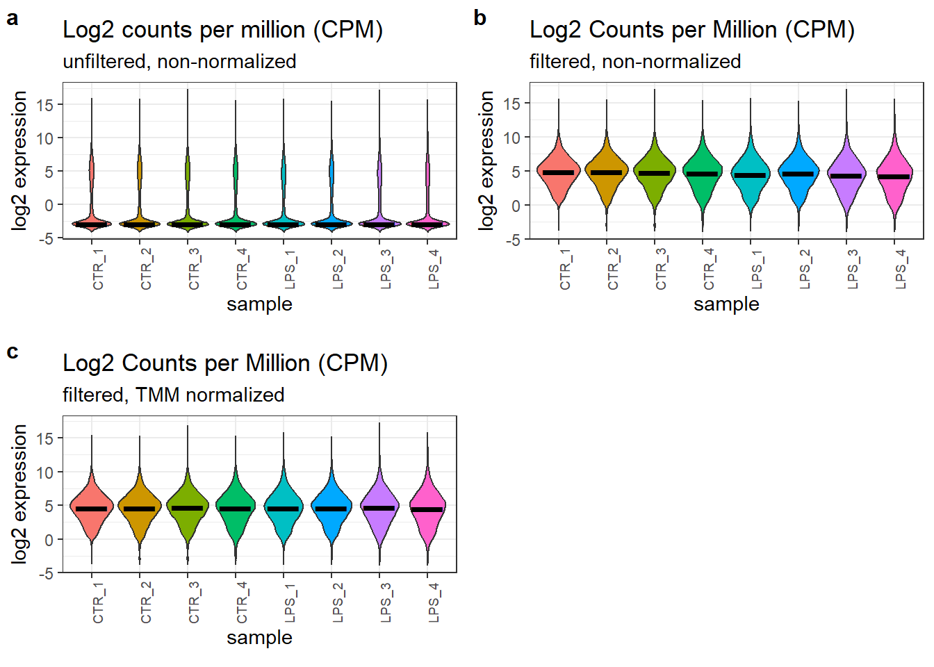
Effect of the filtering and normalization of the count data.
3.5 Principal component analysis
To investigate whether PMA stimulation triggers a distinct gene expression pattern when followed by LPS exposure, we performed Principal Component Analysis (PCA) on the filtered, normalized, and log2-transformed expression counts.
# capture experimental variables as factors from the study design
pca_res <- prcomp(t(data_filtered_norm_log2_cpm), scale. = F, retx = T)
pc_var <- pca_res$sdev^2 #sdev^2 gives the eigenvalues
pc_per <- round(pc_var / sum(pc_var) * 100, 1)
We can see how much each sample influenced each PC, also called the
loadings and using pca_res$x, and plot PC2 vs. PC1.
pca_res_df <- as_tibble(pca_res$x)
pca_plot <- ggplot(pca_res_df) +
aes(x = PC1, y = PC2, color = treatment) +
geom_point(size = 4) +
stat_ellipse() +
xlab(paste0("PC1 (",pc_per[1], "%", ")")) +
ylab(paste0("PC2 (",pc_per[2], "%", ")")) +
labs(
    title = "PCA plot",
    subtitle = "Differentiated U-937 stimulated with LPS for 6h") +
coord_fixed() +
theme_bw() #+ theme(aspect.ratio = 1)

plot_grid(pca_plot)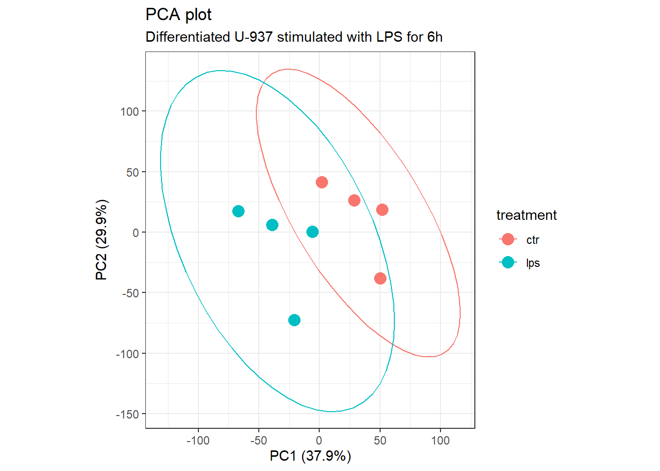
Principal Component Analysis.
The first two principal components (PC1 and PC2) explain approximately 67.8% of the total variance in the gene expression data. However, despite a slight tendency for separation, we are unable to clearly distinguish a unique gene expression signature for each group based solely on the PCA plot. Additionally, there appears to be one outlier point in each group. We will investigate these potential outliers further to determine if they are caused by batch effects and whether their removal is statistically justified.
3.6 Batch effect
In the previous PCA analysis, we observed a potential outlier in each treatment group. To investigate whether these outliers might be caused by batch effects and whether their removal is necessary, we will generate additional PCA plots incorporating replicate number as a factor.
It’s worth noting that sample “WT_Unsort_01” shares the same replicate number (“1”) with sample “WT_Unsort_LPS_09”. Additionally, the naming convention for these two samples differs from all the others, potentially indicating a completely different biological replicate or something more complex. We will take this information into account during our analysis.
# we capture the replicate number as a variable from the study design
sample <- factor(study_design$name)
replicate <- factor(study_design$replicate)

# we first prepare a tibble with data and variables for PC1 -> PC4
pca_res_df <- pca_res$x[, 1:4] %>%
    as_tibble() %>%
    add_column(treatment = treatment, replicate = replicate, sample = sample)

pca_pivot <- pivot_longer(pca_res_df, cols = PC1:PC4, names_to = "PC", values_to = "loadings")

ggplot(pca_pivot) +
aes(x = sample, y = loadings, fill = replicate) +
# we can iteratively 'paint' different covariates using the 'fill' aes
geom_bar(stat = "identity") +
facet_wrap(~PC) +
labs(title = "PCA 'small multiples' plot") +
theme_bw() +
#theme(axis.text.y = element_blank()) +
coord_flip()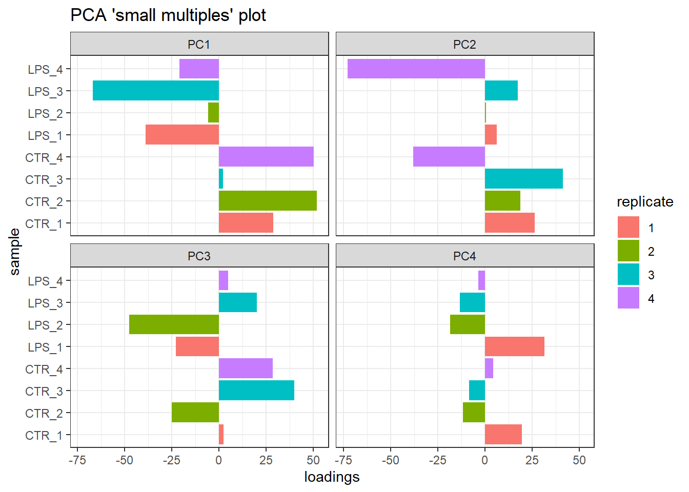
Small multiple PCA plots delineating the potential batch effect.
Our analysis revealed a potential batch effect. Replicate factor significantly impacts PC2, explaining approximately 29.9% of the total variance, with a lesser influence on PC4. Interestingly, replicate ‘4’ appears to contribute most to this variation.
Furthermore, the public data available doesn’t provide enough clarity to definitively confirm the origin of samples “WT_Unsort_01” and “WT_Unsort_LPS_09” due to their distinct naming convention. This ambiguity, combined with the potential batch effect from replicate ‘4’, leads us to exclude this replicate from both treatment groups. Consequently, we proceed with the analysis using two sets of triplicates, which should be sufficient for further investigation
3.7 Reanalysis of a subset
We will now repeat the entire workflow, utilizing only the high-quality triplicate samples from each group. This replaces the original analysis that included all four replicates (quadruplicates).
study_design <- study_design %>%
    filter(!replicate == 4)
samples <- study_design$name
treatment <- study_design$group

expression <- expression[, samples]
The sequencing depth for each of the samples extracted is as follows: 2.2353512^{7}, 1.8531783^{7}, 1.6770369^{7}, 1.6285988^{7}, 8.835079^{6}, 9.051944^{6}.
data_dgelist <- DGEList(expression)
data_cpm <- cpm(data_dgelist)  # use the 'cpm' function from EdgeR to get counts per million
Now the column sums of the cpm data are: 10^{6}, 10^{6}, 10^{6}, 10^{6}, 10^{6}, 10^{6}.
log2_cpm <- cpm(data_dgelist, log=TRUE)
log2_cpm_df <- as_tibble(log2_cpm, rownames = "gene") # transformation into a dataframe
colnames(log2_cpm_df) <- c("gene", samples)
# use the tidy package to 'pivot' your dataframe (from wide to long)
log2_cpm_df_pivot <- pivot_longer(
    log2_cpm_df, # dataframe to be pivoted
    cols = 2:7,                 # column names to be stored as a SINGLE variable
    names_to = "samples",       # name of that new variable (column)
    values_to = "expression"    # name of new variable (column) storing all the values (cpm)
)
We can have a look at a sample of the resulting dataframe:
p4 <- ggplot(log2_cpm_df_pivot) +
aes(x = samples, y = expression, fill = samples) +
geom_violin(trim = FALSE, show.legend = FALSE) +
stat_summary(
    fun = "median", geom = "point",
    shape = 95, size = 10, color = "black",
    show.legend = FALSE) +
labs(
    y = "log2 expression", x = "sample",
    title = "Log2 counts per million (CPM)",
    subtitle = "unfiltered, non-normalized") +
theme_bw() + theme(aspect.ratio = 1/2.5) +
theme(axis.text.x = element_text(angle = 90, size = 7))The dimension of the filtered subset dataset is (11400, 6). We then proceed as previously and create the second figure panel for filtered but non-normalized, log2-transformed count data.
log2_cpm_filtered <- cpm(data_dgelist_filtered, log = TRUE)
log2_cpm_filtered_df <- as_tibble(log2_cpm_filtered, rownames = "gene")
colnames(log2_cpm_filtered_df) <- c("gene", samples)
log2_cpm_filtered_df_pivot <- pivot_longer(
    log2_cpm_filtered_df,
    cols = 2:7,
    names_to = "samples",
    values_to = "expression"
)

p5 <- ggplot(log2_cpm_filtered_df_pivot) +
aes(x = samples, y = expression, fill = samples) +
geom_violin(trim = FALSE, show.legend = FALSE) +
stat_summary(
    fun = "median", geom = "point",
    shape = 95, size = 10, color = "black",
    show.legend = FALSE) +
labs(
    y = "log2 expression", x = "sample",
    title = "Log2 Counts per Million (CPM)",
    subtitle = "filtered, non-normalized") +
theme_bw() + theme(aspect.ratio = 1/2.5) +
theme(axis.text.x = element_text(angle = 90, size = 7))
data_dgelist_filtered_norm <- calcNormFactors(data_dgelist_filtered, method = "TMM")
data_filtered_norm_log2_cpm <- cpm(data_dgelist_filtered_norm, log = TRUE)
log2_cpm_filtered_norm_df <- as_tibble(data_filtered_norm_log2_cpm, rownames = 'gene')
colnames(log2_cpm_filtered_norm_df) <- c("gene", samples)
log2_cpm_filtered_norm_df_pivot <- pivot_longer(
log2_cpm_filtered_norm_df,
cols = 2:7,
names_to = "samples",
values_to = "expression"
)
p6 <- ggplot(log2_cpm_filtered_norm_df_pivot) +
aes(x = samples, y = expression, fill = samples) +
geom_violin(trim = FALSE, show.legend = FALSE) +
stat_summary(
fun = "median",
geom = "point",
shape = 95,
size = 10,
color = "black",
show.legend = FALSE) +
labs(
y = "log2 expression", x = "sample",
title = "Log2 Counts per Million (CPM)",
subtitle = "filtered, TMM normalized") +
theme_bw() + theme(aspect.ratio = 1/2.5) +
theme(axis.text.x = element_text(angle = 90, size = 7))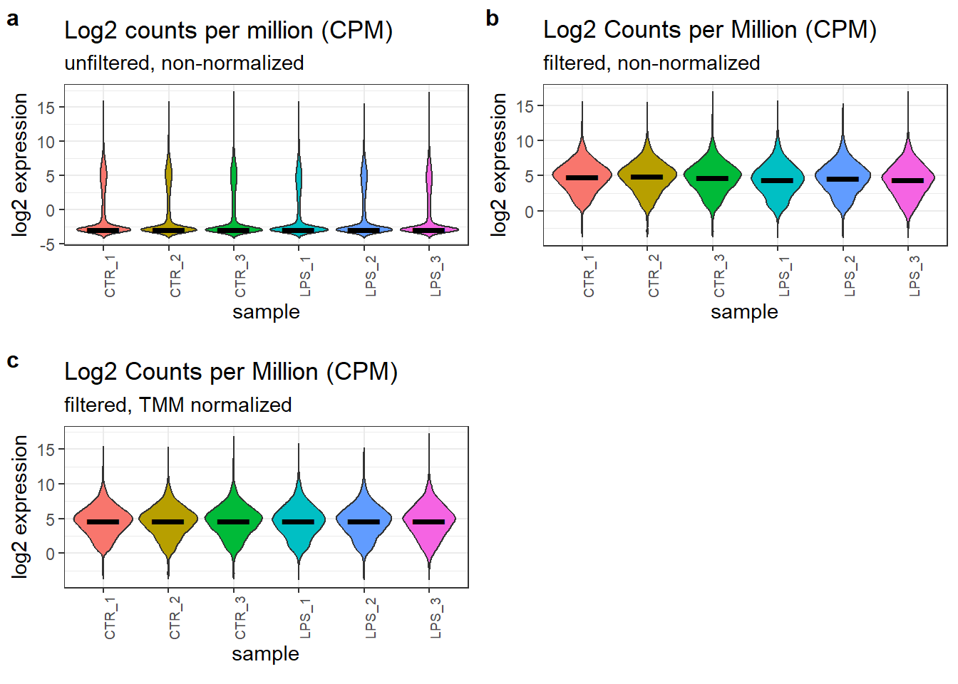
Effect of the filtering and normalization of the count data.
3.8 PCA using modified dataset
Our primary objective is to investigate whether LPS stimulation triggers a distinct gene expression profile. To achieve this, we will perform PCA on the filtered, normalized, and log2-transformed expression counts from the high-quality triplicate samples. An interactive PCA plot will be particularly useful for this analysis, as it allows us to explore the data dynamically and identify potential clustering patterns between the stimulated and unstimulated groups.
pca_res <- prcomp(t(data_filtered_norm_log2_cpm), scale. = F, retx = T)
pc_var <- pca_res$sdev^2 #sdev^2 gives the eigenvalues
pc_per <- round(pc_var / sum(pc_var) * 100, 1)

pca_res_df <- as_tibble(pca_res$x)

# pca_plot_2 <- ggplot(pca_res_df) +
ggplot(pca_res_df) +
aes(x = PC1, y = PC2, color = treatment) +
geom_point(size = 3) +
stat_ellipse() +
xlab(paste0("PC1 (",pc_per[1], "%", ")")) +
ylab(paste0("PC2 (",pc_per[2], "%", ")")) +
labs(
    title = "PCA plot",
    subtitle = "Differentiated U-937 stimulated with LPS for 6h") +
coord_fixed() +
theme_bw() #+ theme(aspect.ratio = 1)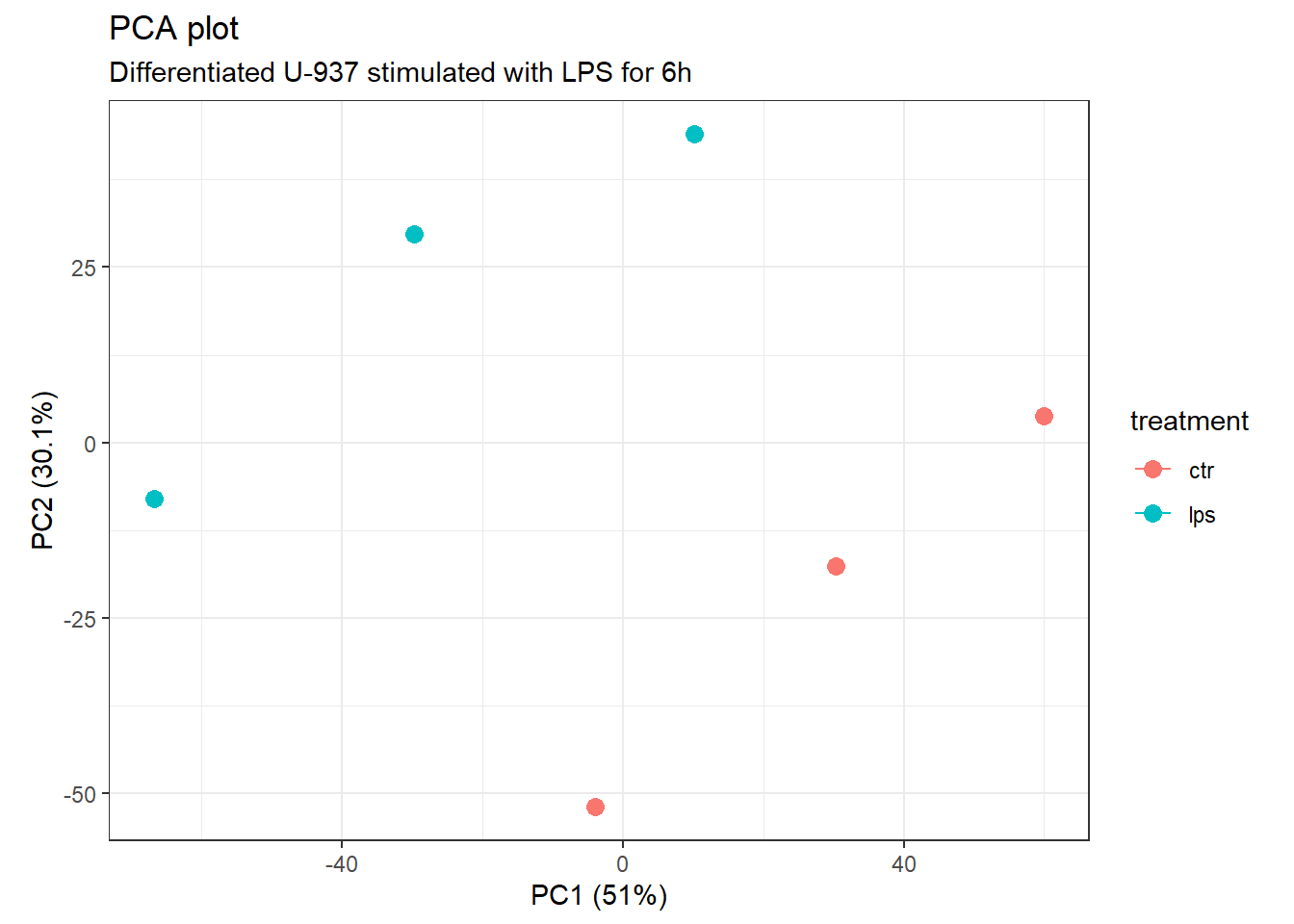
Principal Component Analysis.
PC1 and PC2 account for 81.1% of the total variance. In addition, the treatment groups are now clearly separated even if a more prominent clustering would have been expected from the previous analysis.
4 Differential Gene Expression
To identify genes whose expression is significantly altered by LPS treatment, we employed a statistical approach in EdgeR. Here’s a breakdown of the key steps involved:
- Addressing Variability: we first addressed potential variability in gene expression levels using a method called voom. This technique assigns weights to each gene based on its average expression and how much its variation changes with that average. This helps to normalize the data and ensure more reliable comparisons.
- Normalization: we then normalized the gene expression data using the TMM method within EdgeR. This method aims to account for technical biases that might be introduced during data generation, further improving the accuracy of comparisons between samples.
- Differential Expression Analysis: next, we utilized Limma, a statistical package within EdgeR, to identify differentially expressed genes (DEGs). Limma employs a combination of linear modeling and Bayesian statistics to identify genes that are either up-regulated or down-regulated in LPS-treated U-937 cells compared to controls after 6 hours of treatment.
- Stringency Criteria: to focus on the most robust changes in gene expression, we applied relatively stringent criteria. We considered genes with a fold-change threshold of 1.5 or greater. This means a gene must be at least 1.5 times more or less abundant in LPS-treated cells compared to controls. This threshold is stricter than commonly used values, which can be 5 to 25 times lower. Additionally, we set a false discovery rate (FDR) threshold of 0.25 to limit the number of false positives in our analysis.
4.1 Data fitting
# model design
group <- factor(
    study_design$group,
    levels = c("ctr", "lps"),
    labels = c("CTR", "LPS")
)
design <- model.matrix(~0 + group)
colnames(design) <- levels(group) # beware the issue with name starting with digit in makeContrasts

# model mean-variance trend and fit linear model to data the VOOM function from
# Limma package models the mean-variance relationship smoothed curve is used to obtain
# weights for each gene and sample that are passed into limma along with the Log2 CPMs
v.DEGList.filtered.norm <- voom(data_dgelist_filtered_norm, design, plot = TRUE)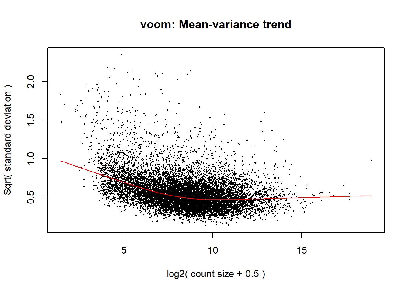
Removal of heteroscedascity by applying precision weights to each gene based on its mean-variance relationship.
fit <- lmFit(v.DEGList.filtered.norm, design=design)

# Contrast matrix for pairwise comparisons
contrast.matrix <- makeContrasts(
    diff = LPS - CTR,
    levels = design
)

# extracting bayesian stats for the linear model fit
fits <- contrasts.fit(fit, contrast.matrix)
ebFit <- eBayes(fits)
It’s important to note that the approach we used here, comparing all conditions to a control group, can be simplified if this is the only comparison of interest. Instead of defining a contrast matrix, we can directly incorporate treatment information into the model by fixing the intercept to the treatment term (e.g., ~treatment). This inherent contrast removes the need for a separate contrast matrix, streamlining the process as shown below:
4.2 Identification of DEGs
The TopTable function in Limma provides various statistics to help identify differentially expressed genes (DEGs). Here’s a breakdown of some key terms:
- logFC (log Fold Change): this value indicates the magnitude and direction of change in gene expression between compared groups. A positive value signifies upregulation, while a negative value indicates downregulation. The magnitude reflects how much the expression has changed (e.g., logFC of 1.5 suggests a 1.5-fold increase).
- AveExpr (Average Expression): this represents the average expression level of a gene across all samples.
- P.Value (Raw P-value): this measures the statistical significance of the observed expression change for a particular gene. However, p-values alone aren’t sufficient for controlling for multiple testing errors.
- adj.P.Val (Adjusted P-value or FDR): this value, often referred to as the False Discovery Rate (FDR), is a more reliable measure of significance after accounting for multiple comparisons. A commonly used method like Benjamini-Hochberg (BH) is employed for this adjustment. A lower FDR indicates a higher confidence that the observed change is truly due to the treatment and not random chance.
- B statistic: this value represents the log-odds of a gene being differentially expressed. A B value of 1.5 translates to odds of 4.8 to 1 in favor of differential expression. Here, “e” refers to Euler’s constant (approximately 2.718). Higher B values indicate stronger evidence for differential expression.
- t statistic: this statistic reflects the ratio between the logFC and the standard error, which is adjusted across all genes due to the Bayesian approach used by Limma. A larger t-statistic suggests a more robust change in expression.
Note: The actual coefficients used in the analysis can be retrieved using commands like -0.0868448, 0.1089045, 0.0029699, 0.0806193, 0.3435465, -0.0979409. These coefficients are derived from the contrast matrix you defined (see the same command for reference).
Hits <- topTable(
    ebFit,
    adjust = "BH",
    coef = 'diff',
    number = 10000,      # set number = Inf to capture all genes
    sort.by = "logFC"
) %>% as_tibble(rownames = "gene") # conversion to a tibble
The ID column in topTable from the limma package may
arise due to duplicate gene names in the input data.
This happens with the Ensembl annotations that seem to have duplicate
Ensembl ID mappings to the same gene, e.g., in the most recent version
of the matrix file. However, the values for duplicated entries will be
identical, so we could just drop the duplicates without loosing any
information.
4.3 Volcano plots
Our analysis of the volcano plot revealed a limited number of genes (dozens) upregulated following 6 hours of LPS stimulation in PMA-differentiated U-937 cells. Downregulation was less prominent. It’s important to consider this in the context of the cell state: these cells were previously differentiated with PMA before LPS exposure. This might differ from what we observed in the SRP103305 data, where hundreds of genes were upregulated readily after 48 hours of PMA differentiation alone.
# we order the table acc. logFC for annotating the Volcano plot
Hits_ordered <- Hits[order(Hits$logFC, decreasing = TRUE), ]
Hits_ordered$labels <- "" # needs to initialize the column
Hits_ordered$labels[1:15] <- Hits_ordered$gene[1:15]
volcano_top <- ggplot(Hits_ordered) +
aes(y = -log10(adj.P.Val), x = logFC) +
geom_text_repel(
aes(x = logFC, y = -log10(adj.P.Val),
label = ifelse(labels == "", "", labels)),
size = 2) +
geom_point(
color = ifelse(Hits_ordered$labels != "", "red", "grey10"), size = 1) +
# geom_point(color = ifelse(isNA(Hits_select$labels), "black", "red"), size = 1) +
geom_hline(yintercept = -log10(0.25), linetype = "longdash", colour = "grey", size = 1) +
geom_vline(xintercept = lfc.thres, linetype = "longdash", colour = "#BE684D", size = 1) +
geom_vline(xintercept = -lfc.thres, linetype = "longdash", colour = "#2C467A", size = 1) +
labs(
title = "Volcano plot (top DEGs)",
subtitle = "Differentiated U-937 stimulated with LPS") +
theme_bw() + theme(aspect.ratio = 1)Volcano plot focusing on a selection of genes of interest.
selection <- c("FCGR1A", "FCGR1B", "FCGR2A", "FCGR2B", "FCGR2C", "FCGR3A", "FCGR3B",
"ITGAX", "ITGAM", "HLA-DRA", "IFNGR1", "TNF")
Hits_select <- Hits %>%
    mutate(labels = case_when (gene %in% selection ~ gene)) %>%
    arrange(!is.na(labels), labels) # ordered acc. labels with NA points plotted on top layer
volcano_select <- ggplot(Hits_select) +
aes(y = -log10(adj.P.Val), x = logFC) +
geom_point(
color = ifelse(!isNA(Hits_select$labels), "red", "grey45"),
size = ifelse(!isNA(Hits_select$labels), 1, 1)
) +
geom_text_repel(
aes(x = logFC, y = -log10(adj.P.Val),
label = ifelse(isNA(labels), "", labels)),
max.overlaps = Inf, # ,xlim = c(7,12)
size = 2) +
# geom_point(color = ifelse(isNA(Hits_select$labels), "black", "red"), size = 1) +
geom_hline(yintercept = -log10(0.25), linetype = "longdash", colour = "grey", size = 1) +
geom_vline(xintercept = lfc.thres, linetype = "longdash", colour = "#BE684D", size = 1) +
geom_vline(xintercept = -lfc.thres, linetype = "longdash", colour = "#2C467A", size = 1) +
labs(
title = "Volcano plot (selection of genes)",
subtitle = "Differentiated U-937 stimulated with LPS") +
theme_bw() + theme(aspect.ratio = 1)
plot_grid(volcano_top, volcano_select, labels = "auto", label_size = 12)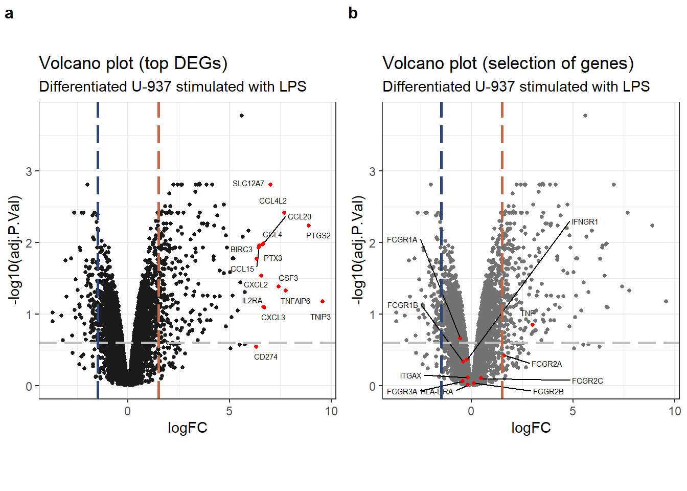
Volcano plots highlighting (a) top DEGs, and (b) selection of genes of interest.
Our analysis identified upregulation of several genes encoding CC-chemokines, along with IL-2R\(\alpha\) and IL-1\(\beta\), following LPS stimulation. However, none of the genes included in the pre-defined selection list exhibited significant or substantial differential expression upon LPS treatment compared to the control group. It’s important to remember that the control group consisted of U-937 cells already differentiated with PMA.
4.4 Decide tests
For decideTests we looked at by genes differentially expressed by 1.5-fold or more with a FDR of 0.25.
results <- decideTests(
    ebFit,
    method = "global",
    adjust.method = "BH",
    p.value = adj.pval.thres,
    lfc = lfc.thres
)
sum_res <- summary(results)
print(sum_res)
## diff
## Down 108
## NotSig 11048
## Up 244Our analysis identified 244 genes that were significantly upregulated and 108 genes that were downregulated following 6 hours of LPS stimulation. The remaining genes did not exhibit statistically significant changes in expression upon LPS treatment compared to the control group.
If we were to analyze additional conditions alongside the LPS treatment, a Venn diagram would be a valuable tool to visualize the overlap between the sets of differentially expressed genes across these conditions. This would help us identify genes that respond consistently and those that are specific to LPS stimulation.
4.5 Top DEGs
Finally we display a table of the 15 most differentially expressed genes upon stimulation with LPS:
topTable(ebFit, adjust = "BH", coef = "diff", number = 15, sort.by = "logFC", resort.by = "logFC") %>%
    as_tibble(rownames = "gene") %>%
    gt() %>%
    tab_header(
        title = "DEG TopTable",
        subtitle = "Differentiated U-937 stimulated with LPS for 6 h"
    ) %>%
fmt_number(columns = 2:7, decimals = 3)| DEG TopTable | ||||||
| Differentiated U-937 stimulated with LPS for 6 h | ||||||
| gene | logFC | AveExpr | t | P.Value | adj.P.Val | B |
|---|---|---|---|---|---|---|
| TNIP3 | 9.565 | 1.224 | 4.356 | 0.003 | 0.066 | −1.406 |
| PTGS2 | 8.907 | 5.592 | 9.676 | 0.000 | 0.006 | 2.980 |
| TNFAIP6 | 7.767 | 3.135 | 5.008 | 0.002 | 0.047 | −0.690 |
| CCL4L2 | 7.681 | 6.288 | 10.917 | 0.000 | 0.004 | 3.851 |
| CSF3 | 7.416 | 0.171 | 5.221 | 0.001 | 0.041 | −0.592 |
| SLC12A7 | 7.020 | −1.097 | 15.591 | 0.000 | 0.002 | 3.111 |
| CXCL3 | 6.698 | 2.951 | 3.975 | 0.006 | 0.080 | −1.849 |
| IL2RA | 6.660 | −0.713 | 3.981 | 0.005 | 0.080 | −1.809 |
| CCL4 | 6.651 | 8.409 | 8.205 | 0.000 | 0.010 | 2.104 |
| CCL20 | 6.608 | 6.024 | 8.092 | 0.000 | 0.011 | 2.057 |
| CXCL2 | 6.553 | 3.776 | 5.832 | 0.001 | 0.029 | 0.134 |
| BIRC3 | 6.465 | 4.561 | 8.001 | 0.000 | 0.011 | 1.957 |
| CCL15 | 6.432 | −1.375 | 7.741 | 0.000 | 0.012 | 1.031 |
| PTX3 | 6.338 | 3.174 | 6.952 | 0.000 | 0.017 | 1.072 |
| CD274 | 6.316 | 1.483 | 2.047 | 0.081 | 0.286 | −4.255 |
4.6 MA-plot
An MA-plot is a helpful tool for visualizing changes in gene expression between two conditions. It plots the log-fold change (M-value) of each gene on the y-axis against the average log-intensity (A-value) on the x-axis. In this specific plot, the M-value represents the fold change in gene expression between cells before and after LPS stimulation, while the A-value reflects the overall average expression level of each gene across both conditions.
Now that we have a better understanding of the MA-plot, let’s delve deeper and explore the expression patterns of the genes we’re particularly interested in. This will help us identify potential trends or outliers related to these specific genes.
#limma::plotMA(ebFit, coef='diff') # doesn't give a comprehensive visualization
shrinkLvV <- topTable(ebFit, number = Inf) %>% # need to have all the genes
    as_tibble(rownames = "gene")

ggplot(shrinkLvV, aes(x = AveExpr, y = logFC)) +
geom_point(
    aes(color = adj.P.Val > adj.pval.thres),
    shape = 20,
    alpha = 0.9) +
geom_hline(yintercept = lfc.thres, linetype = "longdash", colour = "grey", size = 1) +
geom_hline(yintercept = -lfc.thres, linetype = "longdash", colour = "grey", size = 1) +
geom_point(
    data = subset(shrinkLvV, gene %in% selection),
    mapping = aes(x = AveExpr, y = logFC, fill = adj.P.Val > adj.pval.thres),
    shape = 22,
    size = 2,
    color = "black") +
geom_text_repel(
    data = subset(shrinkLvV, gene %in% selection),
    mapping = aes(x = AveExpr, y = logFC, label = gene),
    size = 3) +
labs(
    title = "MA-plot",
    subtitle = "PMA-differentiated U-937 stimulated with LPS",
    x = 'Average log-expression of normalized counts',
    y = 'Log2FC') +
theme_bw() + theme(legend.position = "bottom")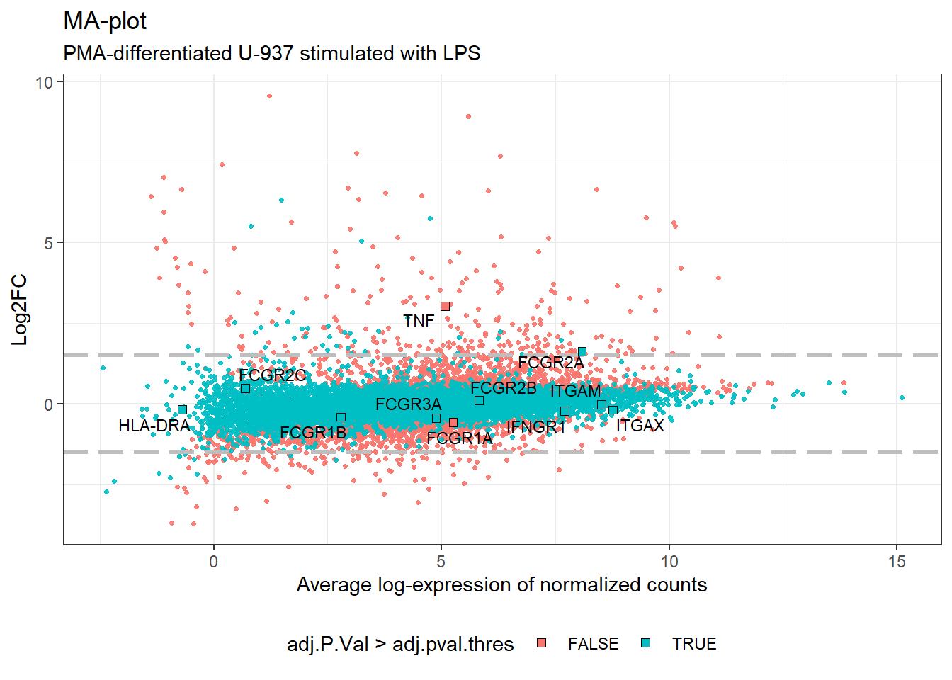
MA-plot highlighting selection of genes.
4.7 Genes of interest
The next step involves creating a data frame to explore gene expression. This data frame will be populated with the average expression and LogFC values for each gene, extracted from the pre-processed (filtered and normalized) count data.
# calculating the mean expression in all groups and LogFC values between groups
mydata.df <- log2_cpm_filtered_norm_df %>%
    mutate(
        CTR.AVG = (CTR_1 + CTR_2 + CTR_3)/3,
        LPS.AVG = (LPS_1 + LPS_2 + LPS_3)/3,
        LogFC = (LPS.AVG - CTR.AVG)
    ) %>%
    mutate_if(is.numeric, round, 2)
After preparing the dataframe we selected some genes of interest, e.g., FCGRs and other co-stimulatory markers of macrophages.
# pulling out the columns corresponding to gene symbols, average expression and LogFC values
mydata.df.sub <- dplyr::select(mydata.df, gene, CTR.AVG, LPS.AVG, LogFC)

# filtering the genes of interest from the subset data (can be modified for other purposes)
mydata.filter <- mydata.df.sub %>%
    dplyr::filter(gene %in% selection) %>%
    dplyr::arrange(desc(LogFC))   # not yet discussed but 48h seems the most significant
# publication-quality table with a few additional options
# (needed to look at the resulting table for proper footnoting)
mydata.filter %>%
gt() %>%
fmt_number(columns=2:4, decimals = 2) %>%
tab_header(
title = md("**Differentiated U-937 cells after stimulation with LPS**"),
subtitle = md("*Log2 filtered and TMM normalized data*")
) %>%
tab_footnote(
footnote = "CD11b",
locations = cells_body(columns = c(gene), rows = c(6))
) %>%
tab_footnote(footnote = "CD11c",
locations = cells_body(columns = c(gene), rows = c(7))
)| Differentiated U-937 cells after stimulation with LPS | |||
| Log2 filtered and TMM normalized data | |||
| gene | CTR.AVG | LPS.AVG | LogFC |
|---|---|---|---|
| TNF | 3.55 | 6.62 | 3.07 |
| FCGR2A | 7.29 | 8.88 | 1.60 |
| FCGR2C | 0.46 | 1.12 | 0.67 |
| HLA-DRA | −0.19 | 0.12 | 0.31 |
| FCGR2B | 5.76 | 5.88 | 0.12 |
| ITGAM1 | 8.53 | 8.49 | −0.04 |
| ITGAX2 | 8.87 | 8.66 | −0.20 |
| IFNGR1 | 7.81 | 7.59 | −0.23 |
| FCGR3A | 5.09 | 4.69 | −0.40 |
| FCGR1B | 3.02 | 2.59 | −0.42 |
| FCGR1A | 5.54 | 4.97 | −0.57 |
| 1 CD11b | |||
| 2 CD11c | |||
Consistent with our observations from the volcano plot, the expression of most genes in our selection list did not exhibit significant changes following LPS stimulation. Conversely, the genes coding for TNF and FCGR2A seem to be further upregulated upon LPS exposure.
- TNF: the log-fold change (LogFC) for TNF is 3.0213993, suggesting an increase in expression after LPS. However, the adjusted p-value (adj.P.Val) is 0.1411226, which requires further investigation for statistical significance.
- FCGR2A: Similarly, FCGR2A shows a LogFC of 1.6110023 after LPS stimulation, indicating potential upregulation. The corresponding adj.P.Val is 0.3759021. Here too, we need to consider the adjusted p-value for definitive conclusions.
The remaining genes outside our selection list displayed minimal changes in expression upon LPS stimulation. Their LogFC values generally fell within a narrow range, between -0.6 and 0.7. This suggests a slight trend towards decreased expression after LPS exposure, but the changes were not statistically significant. Interestingly, the expression levels of these genes largely mirrored those observed in the analysis of SRP103305 and U-937 cells differentiated with PMA for 48 hours (data not shown). However, some notable discrepancies were also evident between the studies. These discrepancies could stem from various biological factors, such as variations in the origin of the cell line, the cell passage number at the time of the experiment, or differences in the culture conditions used. Alternatively, the observed variations might be inherent to the RNA-Seq analysis techniques themselves. Further investigation is needed to pinpoint the exact causes of these differences.
5 Functional Enrichment Analysis
Next, we’ll shift our focus to identifying the most prominent gene signatures induced by LPS stimulation. By examining these signatures, we can gain insights into the biological processes most significantly affected by LPS exposure.
5.1 Exploratory analysis
# subseting where rows have actually differentially expressed genes
diffGenes <- v.DEGList.filtered.norm$E[results[, 'diff'] != 0, ]
# conversion into a dataframe using as_tibble and saving to disk for later use with _clust_
diffGenes.df <- as_tibble(diffGenes, rownames = "gene")
write_tsv(diffGenes.df, "DiffGenes_SRP152824.txt")

# calculating the mean expression in all groups and LogFC values between groups
DEGdata.df <- diffGenes.df %>%
    mutate(
        CTR.AVG = (CTR_1 + CTR_2 + CTR_3)/3,
        LPS.AVG = (LPS_1 + LPS_2 + LPS_3)/3,
        LogFC = (LPS.AVG - CTR.AVG)
    ) %>%
    mutate_if(is.numeric, round, 2)
Now we can search manually, sort the genes etc.
datatable(
    diffGenes.df,
    extensions = c('KeyTable', "FixedHeader"),
    caption = "DEGs in U-937 stim with LPS",
    rownames = FALSE,
    options = list(
        keys = TRUE,
        searchHighlight = TRUE,
        pageLength = 10,
        lengthMenu = c("10", "25", "50")
    )
) %>% formatRound(columns=c(2:7), digits=1)
If we look only at the list of genes established at the beginning of this analysis, we don’t see much of exciting information.
DEGdata.df.sub <- DEGdata.df %>%
    dplyr::select(gene, CTR.AVG, LPS.AVG, LogFC)

# filtering the genes of interest from the subset DEG dataframe
DEGdata.filter <- DEGdata.df.sub %>%
    dplyr::filter(gene %in% selection) %>%
    dplyr::arrange(desc(LogFC))
print(DEGdata.filter)
## # A tibble: 1 × 4
## gene CTR.AVG LPS.AVG LogFC
## <chr> <dbl> <dbl> <dbl>
## 1 TNF 3.53 6.62 3.08Among the genes in our pre-defined selection list, only TNF emerged as differentially expressed (DEG) upon LPS stimulation. This is likely because the LogFC and -log10(adj.P) values for the other genes fell below our chosen thresholds for statistical significance. Based on our current analysis, it appears that adding LPS for 6 hours to PMA-differentiated U-937 cells did not trigger a dramatic increase in gene expression, and the observed changes may lack strong statistical support. To gain a deeper understanding of the LPS response, we will now focus on analyzing the other major upregulated genes identified in the broader differential expression analysis. This will allow us to explore the most significantly affected genes and pathways beyond our initial selection list.
5.2 Hierarchical Clustering
To identify genes with similar expression patterns across samples, we employed Pearson correlation. This technique measures the linear relationship between genes. We used Pearson correlation to cluster the 352 differentially expressed genes (DEGs). The results are visualized in a heatmap, where each row represents a gene, and the expression values for each gene across samples are scaled using the z-score method. This z-score scaling ensures all genes are on a comparable scale, allowing for better visualization of relative expression levels and identification of co-expressed gene clusters.
# use 'colorRampPalette' function from the grDevices and RColorBrewer packages
myheatcolors1 <- colorRampPalette(brewer.pal(8, "PiYG"))(25)

# there also many nice colormaps, e.g.
# we can display.brewer.all() and use myheatcolors <- terrain.colors(256)
The first step involves identifying genes that exhibit similar expression levels across different samples following LPS stimulation. To achieve this, we employed a clustering approach. Here’s a breakdown of the process:
- Calculating Similarities: we used the cor function with the Pearson correlation method to compute the similarity (correlation) between each pair of genes.
- Rescaling for Visualization: since correlation values typically range from -1 to 1, we transformed them using the 1-cor function to a 0–2 scale. This rescaling simplifies the interpretation of the heatmap where 0 represents no correlation and values closer to 2 indicate stronger positive correlations (genes tend to increase or decrease together).
- Building a Distance Matrix: finally, we utilized the
as.distfunction to convert the correlation information into a distance matrix. This distance matrix is crucial for the subsequent clustering step, where genes with smaller distances (more similar expression patterns) will be grouped together.
clustRows <- hclust(as.dist(1 - cor(t(diffGenes), method = "pearson")), method = "complete")

# clustering of the samples using the Pearson correlation instead of Pearson
# because it gives equal weight to highly vs lowly expressed transcripts/genes
clustColumns <- hclust(as.dist(1 - cor(diffGenes, method = "spearman")), method = "complete")
5.3 Heatmaps
# Cutting the resulting tree and creating color vector for cluster modules.
# Varying the cut height (h =) to give more or fewer clusters, or force k = number of clusters
module.assign <- cutree(clustRows, k = 2)

# now assign a color to each module (makes it easy to identify and manipulate)
module.color <- rainbow(length(unique(module.assign)), start = 0.1, end = 0.6)
module.color <- module.color[as.vector(module.assign)]
# plot the hclust results as a heatmap
heatmap.2(
diffGenes, Rowv = as.dendrogram(clustRows), Colv = as.dendrogram(clustColumns),
RowSideColors = module.color, col = myheatcolors1,
scale = 'row', labRow = NA, density.info = "none", trace = "none",
cexRow = 1, cexCol = 1, margins = c(8,2), colsep, rowsep, sepcolor="white",
sepwidth=c(0.05,0.05) # block sepration
)
Heatmap and clustering of DEGs and samples. Modules are identified by a color code (left).
Same data but with some interactivity for further exploration:
heatmaply(
    diffGenes,
    Rowv = as.dendrogram(clustRows),
#   Colv = as.dendrogram(clustColumns), # could also use k_col = 2
    k_col = 2,
    main = "Heatmap and clustering of DEGs and samples",
    col = myheatcolors1, fontsize_row = 6, fontsize_col = 8,
    key.title = "Row Z-score",
    dendrogram = 'both',
    show_dend = c(FALSE, TRUE),
    showticklabels = c(TRUE, FALSE),
    scale = "row"
)
While there appears to be some variation between replicates within each group (e.g., LPS replicate 2 shows a less pronounced range of low and high expression genes compared to the other LPS replicates), a clear distinction is evident between the control and LPS-stimulated groups. This aligns with the findings from the volcano plots, where we observed a trend of more upregulated genes than downregulated genes after LPS stimulation.
Visually, the heatmap suggests the presence of three potential clusters. These clusters likely represent groups of genes with distinct expression patterns in response to LPS treatment. Further analysis is needed to confirm these clusters and identify the biological processes or pathways associated with each cluster.
5.4 Clusters of co-expressed genes
Clust
is a fully automated method for identification of clusters (groups) of
genes that are consistently co-expressed (well-correlated) in one or
more heterogeneous datasets from one or multiple species. The program
was installed via pip install clust and ran on the terminal
using the DiffGenes_SRP152824.txt file of Log2 normalized
data saved in the previous DEG section,
therefore the -n 0 101 4 parameters, while increasing the
size of the clusters with -t 0.01, and finally providing
the reps.txt replicate files, as prepared according to the
program’s instructions as follow:
The output of the program is the following: >Clust received 1
dataset with 352 unique genes. After filtering, 352 genes made it to the
clustering step. Clust generated 2 clusters of genes, which in total
include 332 genes. The smallest cluster includes 160 genes, the largest
cluster includes 172 genes, and the average cluster size is 166 genes.

Clust could not find more clusters than as it is summarized in the conclusion from the heatmaps
6 Gene signatures
The previous section explored the potential effects of LPS stimulation on gene expression. We identified differentially expressed genes (DEGs), particularly those upregulated upon LPS exposure (visualized in the heatmaps). These upregulated genes likely play a crucial role in the cellular response to LPS.
In this section, we delve deeper by performing a Gene Ontology (GO) enrichment analysis. This analysis allows us to identify biological processes, molecular functions, or cellular components that are statistically over-represented within the set of upregulated genes. By pinpointing these enriched GO terms, we gain valuable insights into the key functional pathways significantly impacted by LPS stimulation.
6.1 Upregulated genes
We thus analyzed the signature of genes from module 2 which color #0066FF is legended along the y-axis of the heatmap, indicating upregulated genes upon stimulation with LPS, and which represent the major part of the DEGs.
6.2 Gene Ontology enrichment
Functional/Gene Ontology (GO) enrichment analysis of 244 genes
upregulated upon stimulation with LPS was performed using
g:Profiler and the gost function. Of note GO
enrichement analysis uses gene identifiers only and doesn’t require any
data.
# running GO enrichment analysis
gost.res <- gost(rownames(myModule_up), organism = "hsapiens", correction_method = "fdr")

# publication quality static Manhattan plot with specific GO terms highlighted
mygost <- publish_gostplot(
    gostplot(gost.res, interactive = F, capped = T),
    highlight_terms = c(
        "GO:0006954",         # inflammatory response
        "GO:0032496",         # response to LPS
        "KEGG:04668",         # TNF signaling pathway
        "REAC:R-HSA-1280215", # cytokine signalinig
        "TF:M00052",          # NF-kB
        "WP:WP4754"           # IL-18 signaling
    )
)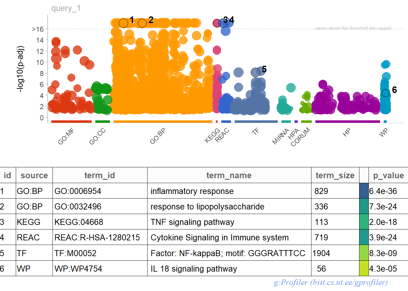
GOST plot and table for upregulated DEGs with interesting GO terms highlighted.
Utilizing the interactive version of the GOST plot can be beneficial for uncovering more specific pathways associated with the LPS response. This interactive exploration can provide a deeper understanding of the underlying biological mechanisms.
The GO enrichment analysis (visualized in the GOST plot) unveils several enriched terms that shed light on the biological processes triggered by LPS stimulation. Here are some key findings:
- Dominant Ontology: the majority of upregulated genes fall within the biological process (GOBP) category. This suggests that LPS primarily influences various cellular processes.
- Immune Response Focus: the enriched terms consistently point towards an immune response to stimuli and cytokine activity. However, the response isn’t specific to processes like phagocytosis or differentiation of macrophages/microglial cells.
- NF-\(\kappa\)B Pathway: notably, the NF-\(\kappa\)B pathway emerges as a significant component across different ontologies, hinting at its potential involvement in the LPS response.
- Intriguing Role of IL-18: the enrichment analysis highlights the role of IL-18, but its precise function in this context warrants further investigation.
While the primary focus of this analysis is on the upregulated genes and their functional enrichment, it’s important to remember that a similar approach could be applied to the downregulated genes. For instance, we could analyze genes clustered in module 1 of the initial heatmap, or any other group deemed relevant to the biological question. This analysis of downregulated genes could provide complementary insights into the cellular response to LPS stimulation.
6.3 Gene Set Enrichment Analysis
While traditional differential expression analysis focuses on identifying individual genes with statistically significant changes, GSEA offers a complementary approach. It’s a powerful method for uncovering biological pathway activity hidden within gene expression data. Here’s how GSEA works:
- Considering All Genes: unlike methods that rely on pre-selecting differentially expressed genes (DEGs), Gene Set Enrichment Analysis (GSEA) analyzes the expression of all genes in your dataset.
- Ranking Genes: genes are ranked based on a chosen metric, such as the log2 fold-change or a test statistic. This ranking reflects the degree of differential expression between conditions.
- Pathway Enrichment Scores: GSEA then evaluates predefined sets of genes, often representing known biological pathways or functional categories. It calculates an enrichment score for each pathway, indicating whether the genes in that pathway are statistically over-represented at the top or bottom of the ranked gene list. High positive scores suggest the pathway is upregulated, while negative scores indicate downregulation.
- Gene Ontology (GO) Annotations: These predefined gene sets often come from resources like MsigDB, a well-established database of curated gene sets encompassing various biological processes, molecular functions, and cellular components.
- Pre-ranked Analysis: The most common GSEA method, known as “pre-ranked,” utilizes the ranked gene list we generated earlier (e.g., based on log2 fold-change) as input for the enrichment analysis.
For our GSEA, we’ll leverage the C5 ontology gene
set, which can be downloaded from the MsigDB website from the GSEA
server. This gene set encompasses various biological processes and
pathways. To perform the GSEA, we’ll utilize the pre-processed gene
expression data stored in the mydata.df dataframe. As
mentioned earlier in the Raw Gene
Expression section, this dataframe contains filtered and
log2-normalized expression values for all genes.
# there are a few ways to get msigDB collections into R
hs_gsea_c5 <- read.gmt("c5.all.v2023.2.Hs.symbols.gmt") # gene set collection predownloaded

# another option is to use the msigdb package to access up-to-date collections
#hs_gsea <- msigdbr(species = "Homo sapiens") # getting all collections with human gene IDs
# since msigdbr returns a tibble, we use dplyr to do a bit of wrangling
#hs_gsea_c5 <- msigdbr(
#  species = "Homo sapiens", # change depending on species your data came from
#  category = "C5") %>%      # 'cell type' signature gene sets
#    dplyr::select(gs_name, gene_symbol) # getting the name and gene symbols in each set

# constructing a named vector using LogFC values
mydata.gsea <- mydata.df$LogFC
names(mydata.gsea) <- as.character(mydata.df$gene)
mydata.gsea <- sort(mydata.gsea, decreasing = TRUE)

# running GSEA using the GSEA function from clusterProfiler
myGSEA.res <- GSEA(mydata.gsea, TERM2GENE = hs_gsea_c5, verbose=FALSE, seed = 10)
myGSEA.df <- as_tibble(myGSEA.res@result)
# display
myGSEA.df %>%
mutate(displayID = str_sub(ID, start = -30, end = -1)) %>% # shorten ID text
select(c(displayID, setSize, enrichmentScore, NES, pvalue)) %>% # remove unused variables
arrange(desc(NES)) %>%
slice(1:20) %>%
gt() %>%
tab_header(
title = md("**Gene set enrichment analysis**"),
subtitle = md("*Differentiated U-937 cells after stimulation with LPS (6 h)*")
) %>%
fmt_number(columns = 3:4, decimals = 3)| Gene set enrichment analysis | ||||
| Differentiated U-937 cells after stimulation with LPS (6 h) | ||||
| displayID | setSize | enrichmentScore | NES | pvalue |
|---|---|---|---|---|
| NG_RECEPTOR_REGULATOR_ACTIVITY | 144 | 0.766 | 2.807 | 1e-10 |
| GOMF_CYTOKINE_ACTIVITY | 72 | 0.836 | 2.771 | 1e-10 |
| GOBP_RESPONSE_TO_INTERLEUKIN_1 | 85 | 0.821 | 2.768 | 1e-10 |
| ULAR_RESPONSE_TO_INTERLEUKIN_1 | 70 | 0.838 | 2.765 | 1e-10 |
| GOMF_CYTOKINE_RECEPTOR_BINDING | 127 | 0.766 | 2.762 | 1e-10 |
| INE_MEDIATED_SIGNALING_PATHWAY | 317 | 0.690 | 2.724 | 1e-10 |
| O_MOLECULE_OF_BACTERIAL_ORIGIN | 229 | 0.707 | 2.708 | 1e-10 |
| GOBP_NEUTROPHIL_CHEMOTAXIS | 66 | 0.823 | 2.680 | 1e-10 |
| GOBP_NEUTROPHIL_MIGRATION | 80 | 0.791 | 2.658 | 1e-10 |
| PONSE_TO_TUMOR_NECROSIS_FACTOR | 166 | 0.715 | 2.655 | 1e-10 |
| GOBP_GRANULOCYTE_CHEMOTAXIS | 76 | 0.793 | 2.651 | 1e-10 |
| AR_RESPONSE_TO_BIOTIC_STIMULUS | 177 | 0.703 | 2.618 | 1e-10 |
| OTEIN_COUPLED_RECEPTOR_BINDING | 116 | 0.731 | 2.603 | 1e-10 |
| GOBP_RESPONSE_TO_BACTERIUM | 359 | 0.650 | 2.581 | 1e-10 |
| GOBP_GRANULOCYTE_MIGRATION | 92 | 0.754 | 2.570 | 1e-10 |
| RESPONSE_TO_TYPE_II_INTERFERON | 96 | 0.743 | 2.564 | 1e-10 |
| GOBP_RESPONSE_TO_CHEMOKINE | 53 | 0.816 | 2.563 | 1e-10 |
| RESPONSE_TO_TYPE_II_INTERFERON | 81 | 0.757 | 2.543 | 1e-10 |
| ATION_OF_INFLAMMATORY_RESPONSE | 242 | 0.657 | 2.529 | 1e-10 |
| GOBP_LEUKOCYTE_CHEMOTAXIS | 138 | 0.694 | 2.524 | 1e-10 |
. While we found some relevant terms with enrichment scores (NES) slightly below 2.0, the overall enrichment for macrophage-related terms might be modest. For a more comprehensive understanding of the enriched pathways, additional resources are available. You can find details about the genes contributing most to the enrichment (core enrichment) in the corresponding tsv file or within an interactive table below. These resources can provide valuable insights into the key players involved in the LPS-induced response.
datatable(
    myGSEA.df %>%
        subset(select = -c(Description, qvalue, rank, leading_edge, core_enrichment)), # make some space
        extensions = c('KeyTable', "FixedHeader"),
        rownames = FALSE,
        caption = 'Signatures enriched in U-937 stimulated with LPS',
        options = list(
            keys = TRUE,
            searchHighlight = TRUE,
            pageLength = 10,
            lengthMenu = c("10", "25", "50")
        )
    ) %>% formatRound(columns=c(3:6), digits=3)
Other sets could analyzed in more details, e.g., the sets H (hallmark gene set), the classical C2 (curated gene set), and also C7 (immunologic signature gene sets) and C8 (cell type signature) gene sets.
6.4 Enrichment plots
To gain further insights into the enriched pathways, let’s generate enrichment plots for specific gene sets. Here, we’ll focus on a set related to macrophages and cytokines, along with a set related to embryonic morphogenesis (for comparison).
The macrophage and cytokine set exhibits an enrichment pattern suggestive of macrophage activation and cytokine production upon LPS stimulation. This aligns well with the overall findings of immune response activation observed earlier.
It’s important to acknowledge that some gene ontologies seemingly unrelated to myeloid cell activation might also show high enrichment scores (NES) as seen in the previous visualization. This highlights the potential for LPS stimulation to have broader cellular effects beyond just macrophage activation.
terms <- c("GOMF_CYTOKINE_ACTIVITY", "GOBP_MACROPHAGE_ACTIVATION", "GOBP_EMBRYONIC_SKELETAL_SYSTEM_DEVELOPMENT", "GOBP_RESPONSE_TO_BACTERIUM")
enrich_plot <- gseaplot2(
    myGSEA.res %>% filter(ID %in% terms),
    geneSetID = 1:4,
    pvalue_table = FALSE,
    title = 'enrichment plot U937+LPS (6 h)'
)

plot_list(enrich_plot) # previously `plot_grid`, see https://github.com/YuLab-SMU/enrichplot/issues/239#issuecomment-1697282604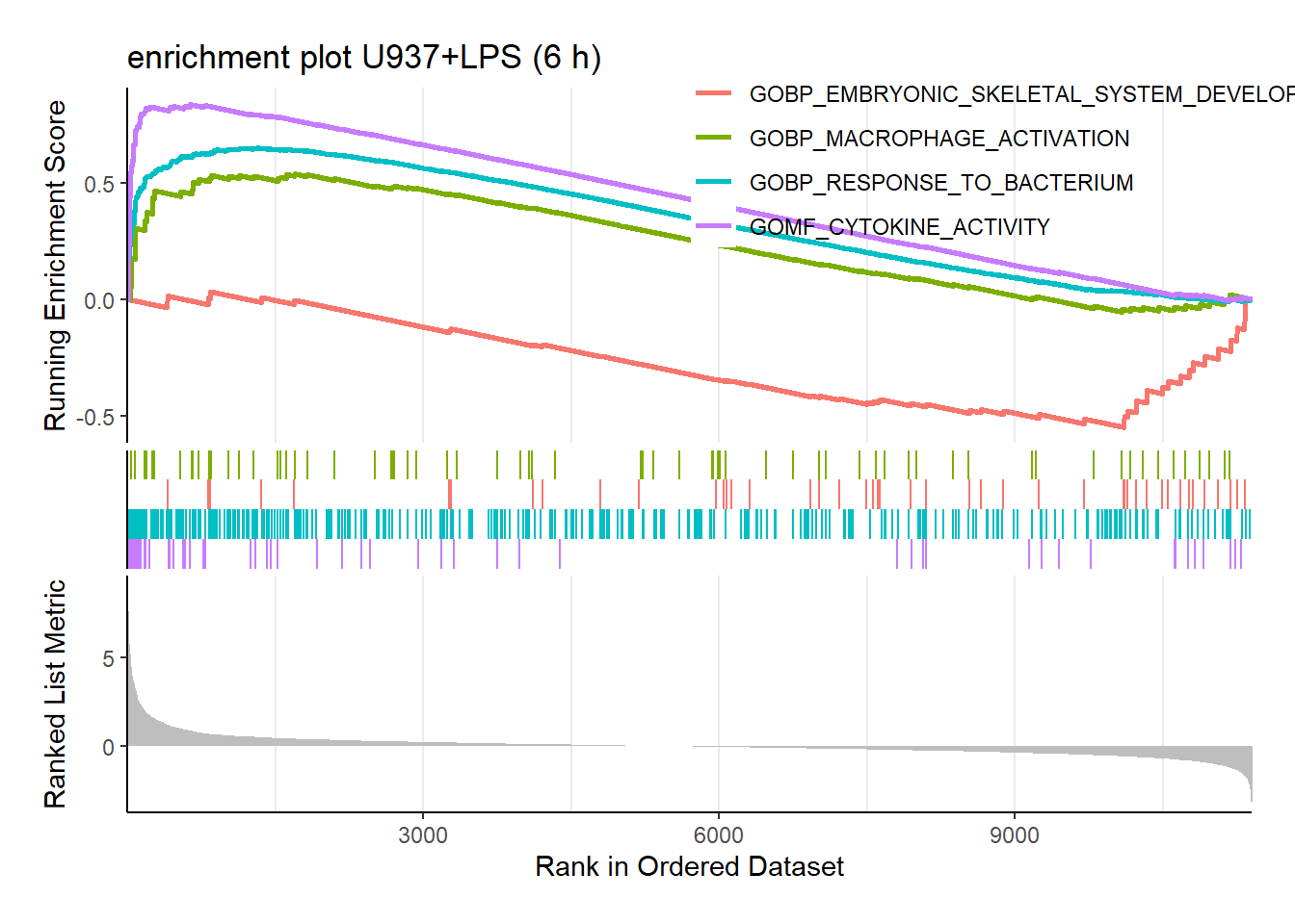
Enrichment plots for some terms of interested.
6.5 clusterProfiler visualizations
clusterProfiler has a variety of options for viewing the over-represented GO terms, as discussed in more details elsewhere.
We will explore the dotplot, sometimes called “bubble plot, which shows the number of genes associated with the first () terms, and the p-adjusted values for these terms (color). For example, the plot below displays the top genes by gene ratio, i.e., the number of genes in the input list related to GO term, divided by the total number input genes, and not p-adjusted value.
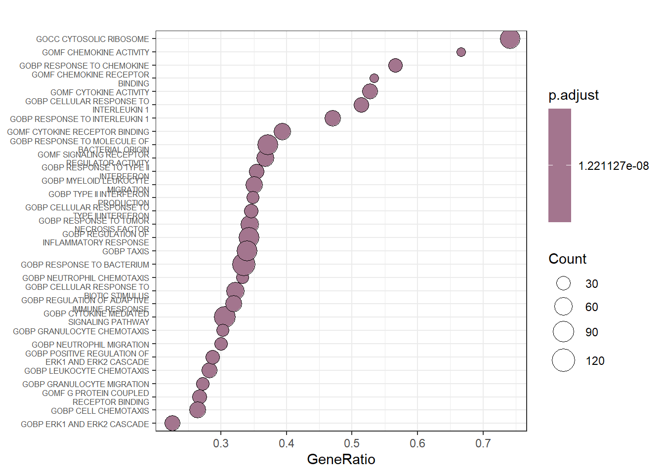
Bubble plot on a sample of gene sets summarizing the previous enrichment analysis.
This plot only confirms the previous finding that genes involved in chemokine and cytokine activity are mostly upregulated by LPS.
The high number of enriched gene sets in our analysis might be partially attributed to the baseline gene expression profile of the control group. It’s important to remember that these control cells were previously differentiated with PMA, which likely activated various pathways already. This is evident from the analysis of the SRP103305 dataset.
Unlike GO enrichment, which focuses on differentially expressed genes, clusterProfiler considers the expression of all genes. In this context, the observed enrichment scores could reflect the pre-existing activated state of the control group due to PMA differentiation, rather than solely highlighting pathways specifically induced by LPS stimulation.
To strengthen the inferences drawn from our enrichment analysis, using a more appropriate control group might be beneficial. Ideally, this control group would consist of U-937 cells without prior PMA differentiation. We could then compare LPS-stimulated cells to both differentiated (PMA) and non-differentiated U-937 cells to obtain a clearer picture of the pathways specifically affected by LPS exposure.
6.6 Indications for further analysis
While our current analysis provides valuable insights into potential pathways affected by LPS stimulation, further investigation can help refine our understanding. Competitive Gene Set Enrichment Analysis (GSEA) is one apporach. We could employ a more refined version of GSEA called “competitive GSEA” using a tool like CAMERA. This approach allows for a more precise definition of the activation state and signaling pathways involved in the response. In competitive GSEA, instead of comparing a gene set to all genes, we compare it to carefully selected control gene sets. This helps to distinguish between true enrichment and random gene set behavior.
As an illustration, we could create a set of random gene signatures and use them alongside our actual gene sets in a competitive GSEA analysis focused on the top 50 upregulated genes in LPS-stimulated cells. By comparing the enrichment scores of the random sets to the scores of our actual gene sets, we can gain a more nuanced understanding of the specific pathways significantly affected by LPS exposure.
myTopHits <- topTable(ebFit, adjust ="BH", coef=1, number=50, sort.by="logFC")
mySig <- rownames(myTopHits) # ~ enrichment positive control
RandomSig <- sample((rownames(v.DEGList.filtered.norm$E)), size = 50, replace = FALSE) # ~ not enriched
collection <- list(real = mySig, fake = RandomSig)
# now test for enrichment using CAMERA: are genes in real top hits commonly differentially expressed than random?
camera.res <- camera(
    v.DEGList.filtered.norm$E,
    collection, design, contrast.matrix[,1] # pairwise comparison of interest
)
print(camera.res)
## NGenes Direction PValue FDR
## real 50 Up 3.340972e-44 6.681945e-44
## fake 50 Down 7.581221e-01 7.581221e-01The 50 genes from the top hits are indeed more commonly differentially expressed than the 50 genes picked randomly (null hypothesis rejected for the ‘real’ set).
For the self-contained GSEA with ROAST, we’ll utilize the null hypothesis that no genes within a predefined set exhibit differential expression. This means we’ll assess whether the genes in our chosen set behave differently compared to the background of all genes, based on their expression changes after treatment.
# camera requires collections to be presented as a list, rather than a tibble, so we must read in our signatures using the 'getGmt' function
broadSet.C5.ALL <- getGmt("./c5.all.v2023.2.Hs.symbols.gmt", geneIdType=SymbolIdentifier())
broadSet.C5.ALL <- geneIds(broadSet.C5.ALL) #extract as a list
camera.res <- camera(v.DEGList.filtered.norm$E, broadSet.C5.ALL, design, contrast.matrix[,1])
camera.df <- as_tibble(camera.res, rownames = "setName")

# filter based on FDR and display as interactive table
camera.df <- dplyr::filter(camera.df, FDR<=0.01)

datatable(
    camera.df,
    extensions = c('KeyTable', "FixedHeader"),
    rownames = FALSE,
    caption = 'Signatures enriched in leishmaniasis',
    options = list(keys = TRUE, searchHighlight = TRUE, pageLength = 10, lengthMenu = c("10", "25", "50"))
) %>% formatRound(columns=c(4,5), digits=4)Our analysis revealed that LPS stimulation for 6 hours in PMA-differentiated U-937 cells triggered the activation of additional pathways compared to unstimulated cells. Notably, enriched terms pointed towards responses to LPS itself, type II interferon gamma, TNF cytokine, and chemokine activity. These findings suggest that LPS exposure further activates these pathways beyond the baseline state induced by PMA differentiation.
However, it’s important to note that the baseline expression levels of many genes, particularly those involved in inflammation, were already high in the control group. This suggests that these pathways might have been close to maximally activated even before LPS stimulation.
In simpler terms, while LPS treatment caused some additional pathway activation in these pre-differentiated cells, many inflammatory genes were already highly expressed, suggesting a possible ceiling effect on their response.
6.7 GSEA using GSVA
The GSVA method offers a unique perspective on functional enrichment analysis compared to other common methods. Instead of directly comparing genes across samples, GSVA transforms the data to focus on pathway activity within each sample. This allows us to assess how active specific biological pathways are in each sample, providing a more sample-centric view.
GSVA is advantageous because it doesn’t rely on specific assumptions about the data or require pre-defined groups (like control vs. treated). It focuses on identifying relative differences in pathway activity between samples, rather than absolute changes compared to a specific phenotype.
However, it’s important to consider the sample size when using GSVA. For studies with a relatively small number of samples (less than 30), other enrichment methods that incorporate phenotype information might be more statistically powerful for detecting functional enrichment.
6.8 Expression of phagocytosis genes
We extracted the genes from the GOBP_phagocytosis gene set and look at their expression in unstimulated vs. LPS-stimulated U-937 cells on a MA-plot.
phago_genes = as.vector(filter(hs_gsea_c5, term =="GOBP_PHAGOCYTOSIS")$gene)
# beware term and $gene replace gs_name and $gene_symbol using read.gmt() instead of
# msigdbr() and in most recent versions of the database

shrinkLvV_phago <- topTable(ebFit, coef = 1, number = Inf) %>%
    as_tibble(rownames = "gene")

ggplot(shrinkLvV_phago, aes(x = AveExpr, y = logFC)) +
geom_point(aes(
    color = adj.P.Val > adj.pval.thres),
    shape = 20,
    alpha = 0.9) +
geom_hline(yintercept = lfc.thres, linetype = "longdash", colour = "grey", size = 1) +
geom_hline(yintercept = -lfc.thres, linetype = "longdash", colour = "grey", size = 1) +
geom_point(
    data = subset(shrinkLvV_phago, gene %in% phago_genes),
    mapping = aes(x = AveExpr, y = logFC, fill = adj.P.Val > adj.pval.thres),
    shape = 22,
    color = "black") +
geom_text_repel(
    # we only label genes with -(p-value) and abs(LFC) above 1.5 OR A < 0
    data = subset(
        shrinkLvV_phago,
        gene %in% phago_genes
        &
        ((adj.P.Val < adj.pval.thres & abs(logFC) > lfc.thres)
        |
        (adj.P.Val > adj.pval.thres & AveExpr < 0))
    ),
    aes(x = AveExpr, y = logFC, label = gene),
    max.overlaps = Inf, size = 2.5) +
labs(
    title = "MAplot - GOBP_PHAGOCYTOSIS gene set",
    subtitle = "U-937 stimulated with LPS for 6 h",
    x = 'Average log-expression of normalized counts',
    y = 'Log2FC') +
theme_bw() + theme(legend.position = "bottom")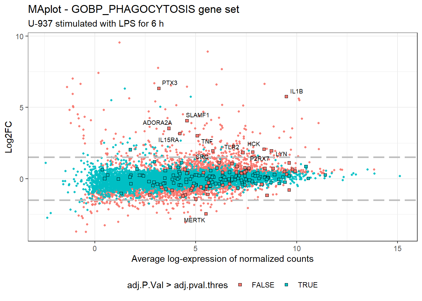
We can appreciate that most of the genes included in the phagocytosis gene set are not significantly regulated in LPS-stimulated cells, except a dozen of genes, including TNF, TRL2, PTX2, IL1B, and IL15RA. Nevertheless most of the set genes are readily expressed at a high level in the control group, with globally an average log-expression >= 5. Don’t forget that those “control” cells are PMA-differentiated cells left unstimulated with LPS.
6.9 Phagocytosis gene clustering
We can also cluster the genes (rows) and the samples (columns) in each condition of the whole gene expression subsetted for genes involved in the GOBP_PHAGOCYTOSIS gene set.
# copying the full dataset, indepently of the DEG status, for later use
allGenes.copy <- v.DEGList.filtered.norm$E
colnames(allGenes.copy) <- study_design$group   # used for averaging the samples using limma::avearrays
allGenes.phago <- allGenes.copy[which(rownames(allGenes.copy) %in% phago_genes), ] %>%
    subset(select = -c(25:27))

# average of the biological replicates
allGenes.phago.AVG <- avearrays(allGenes.phago)

clustRows_phago <- hclust(as.dist(1 - cor(t(allGenes.phago.AVG), method = "pearson")), method = "complete")
clustColumns_phago <- hclust(as.dist(1 - cor(allGenes.phago.AVG, method = "spearman")), method = "complete")

heatmap.2(
    allGenes.phago.AVG, dendrogram = "none",
    revC = TRUE, # column order reversed to show unstim on the right
    col = cool_warm, cexCol = 1.2,
    scale = 'none', density.info = "none", trace = "none",
    key.title = "Log2 norm"
)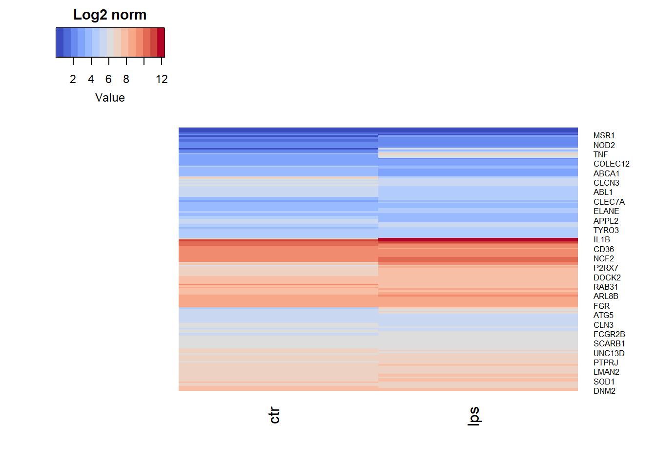
Clustering and heatmap of samples and genes from GOBP PHAGOCYTOSIS.
7 Conclusions
This reanalysis of RNA-Seq data from Odqvist et al. provided valuable insights into the response of PMA-differentiated U-937 cells to LPS stimulation for 6 hours:
- Modest Changes in Gene Expression - The gene expression profiles of LPS-stimulated and unstimulated cells were not dramatically different. While a moderate number of genes (352) exhibited changes upon LPS exposure, the statistical significance threshold (0.25) was relatively high, indicating weaker evidence for differential expression.
- Limited Upregulation of Genes of Interest - Genes of particular interest, such as FCGR3A, FCGR2B, CD163, ITGAM, and DC-SIGN, did not show significant changes in expression after LPS stimulation. The sole exception was a slight, non-significant upregulation of FCGR2A.
- Pre-Activated State of Control Cells - It’s important to consider that the control group consisted of U-937 cells already differentiated with PMA for 48 hours. This pre-activation likely explains the high baseline expression of many genes of interest in the control group, similar to what was observed in the SRP103305 dataset.
- Focus on Cytokine Activity - The overall gene expression signature following LPS stimulation pointed towards cytokine activity within the context of an inflammatory response. However, we found no strong evidence for a robust activation of macrophage-related processes like phagocytosis.
These findings suggest that a 6-hour LPS treatment might not be sufficient to induce a dramatic response in pre-differentiated U-937 cells. Future studies could explore different time points, LPS concentrations, or alternative cell types to gain a more comprehensive understanding of the LPS response. Additionally, using a control group of non-differentiated U-937 cells might provide a clearer picture of LPS-induced changes.
8 Session info
The output from running ‘sessionInfo’ is shown below and details all packages and version necessary to reproduce the results in this report.
# for compiling the Rmd document use:
# rmarkdown::render('analysis_SRP152824.Rmd', 'html_document')
sessionInfo()
## R version 4.3.3 (2024-02-29 ucrt)
## Platform: x86_64-w64-mingw32/x64 (64-bit)
## Running under: Windows 11 x64 (build 26090)
##
## Matrix products: default
##
##
## locale:
## [1] LC_COLLATE=French_France.utf8 LC_CTYPE=French_France.utf8
## [3] LC_MONETARY=French_France.utf8 LC_NUMERIC=C
## [5] LC_TIME=French_France.utf8
##
## time zone: Europe/Paris
## tzcode source: internal
##
## attached base packages:
## [1] stats4 stats graphics grDevices utils datasets
## [7] methods base
##
## other attached packages:
## [1] knitr_1.45 tinytex_0.50
## [3] rmarkdown_2.26 enrichplot_1.22.0
## [5] msigdbr_7.5.1 clusterProfiler_4.10.1
## [7] gprofiler2_0.2.3 GSVA_1.50.1
## [9] GSEABase_1.64.0 graph_1.80.0
## [11] annotate_1.80.0 XML_3.99-0.16.1
## [13] AnnotationDbi_1.64.1 IRanges_2.36.0
## [15] S4Vectors_0.40.2 Biobase_2.62.0
## [17] BiocGenerics_0.48.1 rhdf5_2.46.1
## [19] edgeR_4.0.16 limma_3.58.1
## [21] heatmaply_1.5.0 viridis_0.6.5
## [23] viridisLite_0.4.2 plotly_4.10.4
## [25] DT_0.32 RColorBrewer_1.1-3
## [27] gplots_3.1.3.1 gt_0.10.1
## [29] ggrepel_0.9.5 cowplot_1.1.3
## [31] matrixStats_1.2.0 lubridate_1.9.3
## [33] forcats_1.0.0 stringr_1.5.1
## [35] dplyr_1.1.4 purrr_1.0.2
## [37] readr_2.1.5 tidyr_1.3.1
## [39] tibble_3.2.1 ggplot2_3.5.0
## [41] tidyverse_2.0.0
##
## loaded via a namespace (and not attached):
## [1] splines_4.3.3 bitops_1.0-7
## [3] ggplotify_0.1.2 polyclip_1.10-6
## [5] lifecycle_1.0.4 vroom_1.6.5
## [7] lattice_0.22-6 MASS_7.3-60.0.1
## [9] crosstalk_1.2.1 dendextend_1.17.1
## [11] magrittr_2.0.3 sass_0.4.9
## [13] jquerylib_0.1.4 yaml_2.3.8
## [15] DBI_1.2.2 abind_1.4-5
## [17] zlibbioc_1.48.2 GenomicRanges_1.54.1
## [19] ggraph_2.2.1 RCurl_1.98-1.14
## [21] yulab.utils_0.1.4 tweenr_2.0.3
## [23] seriation_1.5.4 GenomeInfoDbData_1.2.11
## [25] irlba_2.3.5.1 tidytree_0.4.6
## [27] commonmark_1.9.1 DelayedMatrixStats_1.24.0
## [29] codetools_0.2-19 DelayedArray_0.28.0
## [31] DOSE_3.28.2 xml2_1.3.6
## [33] ggforce_0.4.2 tidyselect_1.2.1
## [35] aplot_0.2.2 farver_2.1.1
## [37] ScaledMatrix_1.10.0 TSP_1.2-4
## [39] webshot_0.5.5 jsonlite_1.8.8
## [41] tidygraph_1.3.1 iterators_1.0.14
## [43] foreach_1.5.2 tools_4.3.3
## [45] treeio_1.26.0 snow_0.4-4
## [47] Rcpp_1.0.12 glue_1.7.0
## [49] gridExtra_2.3 SparseArray_1.2.4
## [51] xfun_0.43 qvalue_2.34.0
## [53] MatrixGenerics_1.14.0 GenomeInfoDb_1.38.8
## [55] ca_0.71.1 HDF5Array_1.30.1
## [57] withr_3.0.0 fastmap_1.1.1
## [59] rhdf5filters_1.14.1 fansi_1.0.6
## [61] caTools_1.18.2 digest_0.6.35
## [63] rsvd_1.0.5 timechange_0.3.0
## [65] R6_2.5.1 gridGraphics_0.5-1
## [67] colorspace_2.1-0 GO.db_3.18.0
## [69] gtools_3.9.5 markdown_1.12
## [71] RSQLite_2.3.5 utf8_1.2.4
## [73] generics_0.1.3 data.table_1.15.2
## [75] graphlayouts_1.1.1 httr_1.4.7
## [77] htmlwidgets_1.6.4 S4Arrays_1.2.1
## [79] scatterpie_0.2.1 pkgconfig_2.0.3
## [81] gtable_0.3.4 blob_1.2.4
## [83] registry_0.5-1 SingleCellExperiment_1.24.0
## [85] XVector_0.42.0 shadowtext_0.1.3
## [87] htmltools_0.5.8 fgsea_1.28.0
## [89] scales_1.3.0 png_0.1-8
## [91] ggfun_0.1.4 tzdb_0.4.0
## [93] reshape2_1.4.4 nlme_3.1-164
## [95] cachem_1.0.8 KernSmooth_2.23-22
## [97] parallel_4.3.3 HDO.db_0.99.1
## [99] pillar_1.9.0 grid_4.3.3
## [101] vctrs_0.6.5 BiocSingular_1.18.0
## [103] beachmat_2.18.1 xtable_1.8-4
## [105] evaluate_0.23 cli_3.6.2
## [107] locfit_1.5-9.9 compiler_4.3.3
## [109] rlang_1.1.3 crayon_1.5.2
## [111] labeling_0.4.3 plyr_1.8.9
## [113] fs_1.6.3 stringi_1.8.3
## [115] BiocParallel_1.36.0 babelgene_22.9
## [117] assertthat_0.2.1 munsell_0.5.0
## [119] Biostrings_2.70.3 lazyeval_0.2.2
## [121] GOSemSim_2.28.1 Matrix_1.6-5
## [123] hms_1.1.3 patchwork_1.2.0
## [125] sparseMatrixStats_1.14.0 bit64_4.0.5
## [127] Rhdf5lib_1.24.2 KEGGREST_1.42.0
## [129] statmod_1.5.0 highr_0.10
## [131] SummarizedExperiment_1.32.0 igraph_2.0.3
## [133] memoise_2.0.1 bslib_0.7.0
## [135] ggtree_3.10.1 fastmatch_1.1-4
## [137] bit_4.0.5 gson_0.1.0
## [139] ape_5.7-1